Color Collection : Blue

Wednesday, March 13, 2013

I'm sorry for my absence this past week - I have been so busy, this space has been neglected. 
I'm hoping things will slow down soon! 

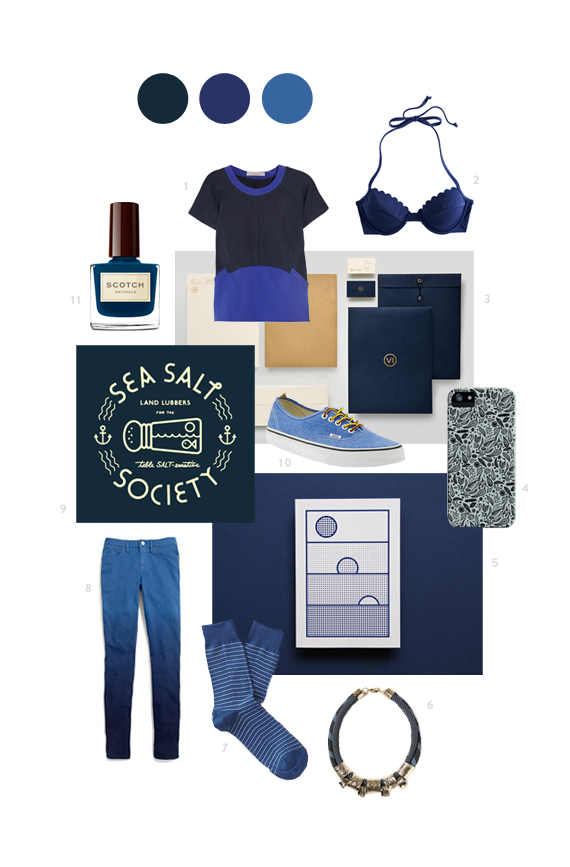
Here are a few blue beauties to inspire your Wednesday! 

Blue
1 - Preen Line - Net-a-Porter   |   2 - Scallopped Swim Top - JCrew   |   3 -  Visio Ingenii - Siddharth Khandelwal   |   4 - Dark Leaves - Marcelo Romero   |   5 - St. Gallen Museum of Art Event - Kasper-Florio   |   6 - Clinched Bungee Necklace - Anthropologie   |   7 - Scout Sock - Richer Poorer   |   8 - Skinny Skinny Colorfade Jeans - Madewell   |   9 - Sea Salt Society - Tim Lahan   |   10 - Authentic - Vans   |   11 - Seaboard - Scotch Naturals

Spaces // Jessica Comingore

Monday, March 4, 2013

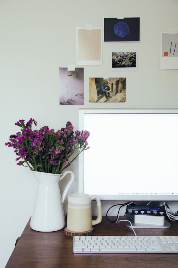
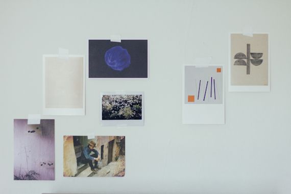
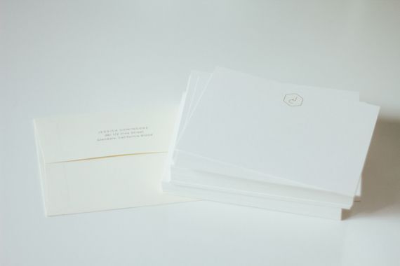
Take a look into the workspace of graphic designer + photographer, Jessica Comingore in today's Spaces feature. Her gorgeous light filled room is sure to inspire! 

Tell us about yourself as a creative.
Hi all! I'm Jessica Comingore and I'm a Los Angeles based designer. I spend my days running a creative studio I founded in 2011, working on projects ranging from graphic design and branding to interior photography and art direction. The variety certainly keeps things interesting, and I can safely say that I love (just about) every minute of it.

Describe your creative journey.
I graduated from The Fashion Institute of Design and Merchandising with a degree in Interior Design and Decorative Arts and spent a few years working for design firms as a project manager post-college. While there, I discovered my love for photography and began shooting a few interiors for my then-boss which kind of opened the door for me to get my feet wet with photography and eventually lead to shooting for other designers around town, and now, a few publications. Similar to my round-about approach to photography, I fed my passion for graphic design through authoring a blog I started while I was in school, and designing the marketing collateral for the last firm I worked at. One job lead to another and a little over a year ago I took the leap to full time freelancing. I feel pretty lucky to be able to run a business where I can have my hands in so many pots and continue to learn and grow with each project.

Share a little bit about your space.
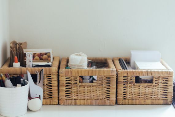
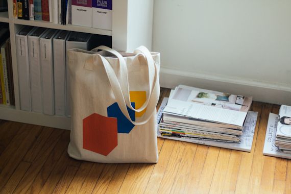
I moved into this guest house about four months ago from a studio not too far away when things started to get a bit claustrophobic working from home. I've got a bit more room to groove here, so it's been a very pleasant transition. I use the dining room as an office and despite having a dining table set up, it's typically filled with stacks of magazines and paperwork. But sometimes I'll carve out a clear spot to enjoy breakfast.

What's your favorite thing about your space?
Most definitely the light. There are windows on every wall, and the light that comes bouncing through them every afternoon is so pretty. There are these big avocado and lemon trees outside that cast the most beautiful shadows on the walls. Sometimes I'll stop everything I'm doing and just watch the patterns they make.

What's one thing you think every creative needs in their space?
Windows! I feel having the world to peer out at (especially for those working at the computer all day) makes a world of difference. I didn't have many windows at my last place, and it could be in my head, but I feel more inspired here being able to look out at the trees and admire nature, even if I'm stuck inside.

Thanks Jessica!

Find Her:
+ Blog

Color Collection : Yellow

Wednesday, February 27, 2013

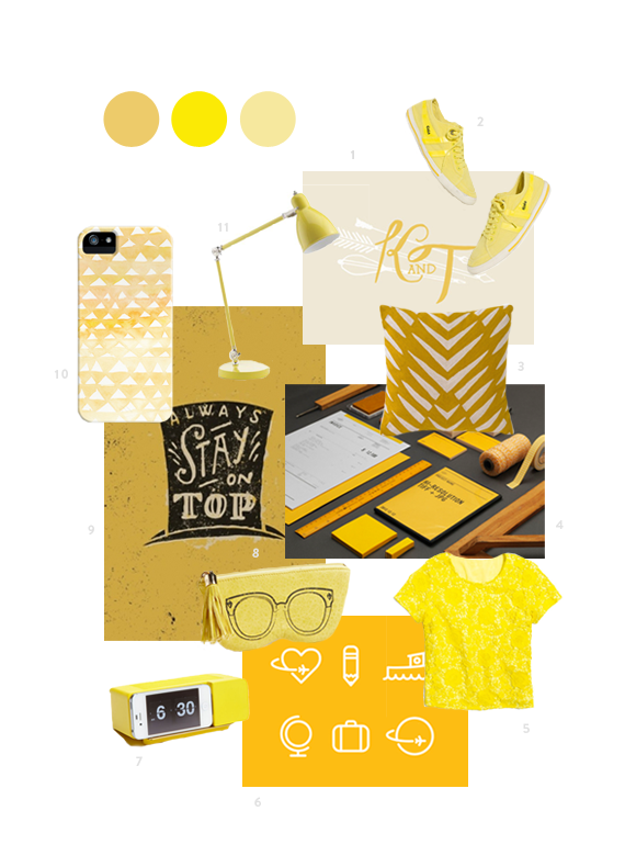
To brighten up your week!

Yellow
1 - Nikole Sparks - Wedding Mark   |   2 - Madewell - Gola Sneakers   |   3 - Dwell Studio - Osa Mustard Pillow   |   4 -  Acre - Studio Branding   |    5 - Madewell - Meadowlace Tee   |   6 - Aaron Bouvier - Jumpstreet Icons   |   7 - Areaware - iPhone Dock   |   8 - Rebecca Minkoff - Leather Sunnies Case   |   9 - Jon Contino - Always Stay On Top   |   10 - Typeandtitle - Yellow Triangles iPhone Case    |   11 - West Elm - Task Lamp

Behance Find : Wire

Tuesday, February 26, 2013

How beautiful are these letterforms by Dan Hoopert on Behance? 
So delicate, light and airy. 
The lines create really amazing shapes and patterns within each letterform! 


Reevaluate

Monday, February 25, 2013


After posting about the busy article on Thursday last week (and hearing all your similar opinons!), plus some thoughts I've been having for a while now,  I've been thinking about what needs changing in terms of my business - designing + blogging.

The business side of designing has really been a learning experience and one that as designers, I think we'll always be figuring out. But I've recently had to remind myself why I'm doing this - because I love it.

That's what matters, right?

With the new site + blog coming soon, I'm trying to figure out exactly what I'm most excited about when working with clients and sharing with you. As readers, what are some things you're most excited about when reading through the blog?

Photos from our weekend away.

Glorification of Busy

Thursday, February 21, 2013

I don't normally do posts like this, the ones that are vulnerable or thought provoking, because it's not really me. I'm definitely not a writer, so this space has always been more visual. But my friend Liz, shared this article with me today about the glorification of busy in our industry, written by Andrew Dumont. So I'm just going to tell you to go read it. 

I'm not going to say much, other than he's so right. I continually find myself working just to work, just ask my husband who often reminds me to just take breaks. I always feel there is something that needs to get done or there is something I could be doing better because someone else is working harder, but like Andrew says "...our bodies can only handle so much heads-down production. It's the law of diminishing returns, and it's very real. It's something that downing a few more cans of RedBull can't solve. Trust me, I've tired."

"Let's stop glorifying over-work, and start congratulating smart work. The truly brilliant people in the world are those that elegantly balance a heavy-workload and the rest of their life. They're also the most satisfied." - Andrew Dumont


Color Collection : Grey

Wednesday, February 20, 2013

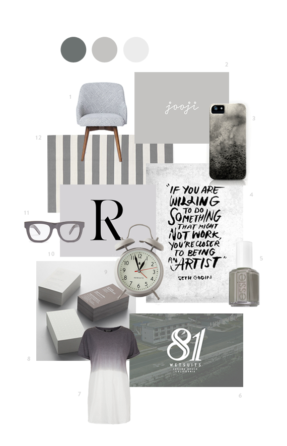
Rounding up my favorite color - grey!

Grey
1 - West Elm - Saddle Office Chair   |   2 - Birch Studio - Jooji Logo   |   3 - Eva Black - Four Cream   |   4 - Emily Okada - Seth Godin Quote   |   5 - Essie - Chinchilly   |   6 - Sticks Stones - 81 Wetsuits   |   7 -  Topshop - Oversized Dip Dye Tee   |   8 - Manic Design - Manor Studio   |   9 - Anthopologie - Convent Alarm Clock   |   10 - The Milanese - Carine Typeface   |   11 - Madewell - Super Cicco Eyeglasses   |   12 - Crate & Barrel - Olin Grey Rug

Behance Find : Dwell

Tuesday, February 19, 2013

I've recently joined Behance because I continually find amazing design work there. I feel like Behance was one of those things you joined back during Undergrad but I never got into it. I really feel like it's a great place to find really mature and wise design work because not only is it filled with great designers, but some of the bigger design agencies display their work on it. Go get inspired! 

This project, by Yi Xiang Lim, is an identity and layout design pitch for Dwell, a travel guide to coastal cities. I seriously wish I could get my hands on it. Not only am I loving it's identity, but the layouts, colors, and textures look so great. I'm also a big fan of mixing textures, I think it really adds to the experience of flipping through the magazine. Check out more images from the project on Behance

Spaces // Jen Serafini

Monday, February 18, 2013

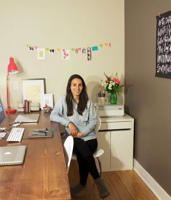
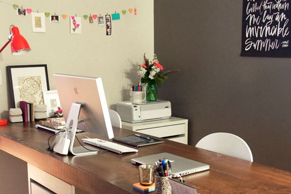
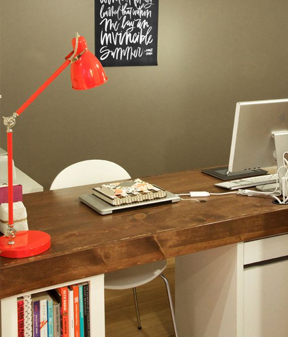
Happy Monday everyone. We're kicking off the week with a peak into Graphic Designer, Jen Serafini's workspace. It's so cool to see Jen's workspace because she was recently inspired by one of the past Spaces features, and made a new desk! It looks awesome!

I'm also starting to see how differently everyone uses their drawing tablets! You'll see here, Jen uses hers directly in front of her keyboard. Mine stays put on the right side. How do you use yours? Left / Middle / Right? 

Check it out!

Tell us about yourself as a creative.
Hi! My name is Jen Serafini and I'm a communications designer and art director living in the Windy City. For me, designing is more than just making things look pretty, but telling a story through every brand and business I work with.

Describe your creative journey.
My creative journey started at a very young age. I consider design my first true love - besides Bruce Springsteen, of course! (I'm  a NJ girl if you couldn’t tell ) I was always intrigued by images and typography and how they worked together to tell beautiful stories. I worked up a pretty sweet collection of clothing labels, product packaging and magazine cut outs and displayed them all over my room. At the time I didn't really know what all of that was, but I really enjoyed looking at it.

I took a lot of art classes growing up, and then in high school we had a class called graphic design - from then on it all made sense and I knew that was for me! It's funny to think back on what I thought design was and what I know it to be now - at the time it was a lot of calligraphy, pen & ink drawing and the occasional Photoshop project. College really opened my eyes to all of the possibilities when pursuing design.

I spent four years at Syracuse University where I earned my BFA in communications design. It really taught me to look at design as a holistic and strategic process that goes beyond just a pretty picture. When everything comes together and tells a cohesive story - that’s the good stuff :)

Right now I work from home as a senior art director. I also love working on freelance projects and of course blog every chance I get.

Share a little bit about your space.
Because I work from home, I really wanted a space that was functional and inspiring. I used to have a small desk facing the wall, but it was so boring that I ended up working from the couch most days! Since my husband also does a lot of work at the computer, we decided to build a desk big enough for both of us to to work side by side and also face outward toward the rest of our apartment. We used our existing Ikea book shelf legs and built an 8 foot long desk to sit on top of them. It was such a fun project for both of us, props to my husband for figuring out how to put the whole thing together! I was more of the motivating support :) Now, I absolutely LOVE my work area, it's so functional and large enough that I don't feel cramped for space. Since we rent, I didn't want to put too many holes in the wall, so I made a string line to be able to hang changing inspiration. We just got that black and white print for the back wall from Pennyweight Goods which I think adds the perfect touch.

What's your favorite thing about your space?
I have to say my favorite thing is definitely the desk. When you go through the trouble of building something, you feel that much more motivated to work at it. That desk was built with a lot of love and hard work, and that makes it a really special piece for both of us.

What's one thing you think every creative needs in their space?
Okay I have two things. First is a Wacom tablet!! This has changed my life. I started using it  a few years ago and  I can't imagine going back to a regular mouse. It makes designing much more natural, not to mention way easier on your wrists. Second is an area to display inspiration. Whether you have a permanent framed wall or a board where you can tack things up, it's always nice to have things to look at. It doesn't even have to be design pieces; a picture or a note can really make the difference when you're feeling uninspired.

Thanks Jen!

Check her out:

+ Blog

Color Collection : Fuchsia

Wednesday, February 13, 2013

In honor of Valentine's Day tomorrow, I thought I would round up a collection of various Fuchsia finds. 

In need of a last minute Valentine's Day card? Check out my free V-Day download from last year!

Fuchsia
1 - Madewell - Scallop Lace Top   |    2 - NARS - Lipstick Heat Wave    |    3 - Studio Pattern - 2013 Calendar    |    4 - Britt Brass - Pink Abstract    |    5 - Tchmo - Untitled ( Cloudscape )    |    6 -  Sylvia Prats - Personal Branding     |    7 -  Madewell - Palate Trousers in Dash     |    8 - RoAndCo Studio - Nine10Eleven     |    9 - Anthrologie - Tie Dye Pouch    |    10 - Baggu - Neon Fox    |    11 - Clase Bcn - Sia Murt

Passport

Tuesday, February 12, 2013

Really loving this brand identity for design bureau, Passport. The colors are so engaging. You really can't go wrong when pairing neutrals like kraft, nude and cream with any kind of color, but this indigo, violet color is really amazing. This is also a really great example of how beneficial one stamp can be for various print materials. 

Pillows

Monday, February 11, 2013


I've put off 'decorating' our bedroom for the longest time. It's one of those things I always felt like doesn't get a lot of attention so why worry about it? Well I've decided this has to change. After a long day of work, I want to crawl into bed relaxed and inspired, like the rest of our home feels. To start, I thought I would get some miss-matched / matching pillows, to go with our cream bead spread.  I ordered these three little beauties this weekend. I've been eying the West Elm dip-dyed pillow for a while and CANNOT stop looking at Victoria, of SF Girl by Bay's cottage makeover. It's SO perfect. Right up my alley, with all that black/white/neutral. So I had to get the little Swiss cross pillow she shared. 

What about you? Do you feel the same way about your bedroom? Or do you have one room in your house that might get neglected? How do you make a room inspiring? 


Twitter Calligraphy

Friday, February 8, 2013

I'm freaking out about how awesome this project is. 

Dave Foster, announced on Twitter he was going to write out the names of anyone who followed him until he reached one thousand followers. And those followers of course came a lot faster than he would've thought. Here are just three of of the thirty five


Top-Notch Type : #33

Thursday, February 7, 2013

Pop over to Emmadime and get your hands on this awesome FREE script font! 

Color Collection : Cream

Wednesday, February 6, 2013


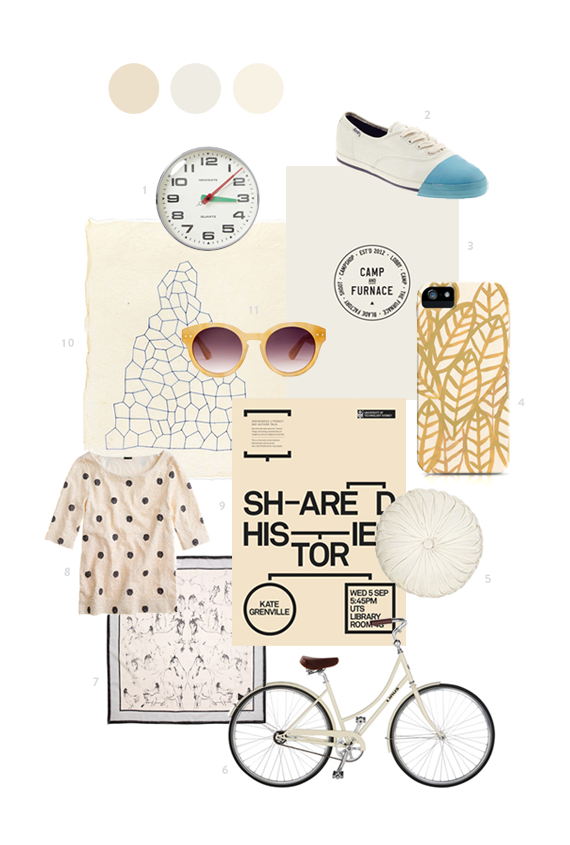
I've got a few new columns lined up with the blog re-design coming (including an awesome conributor) but I thought I'd start one a little early! This column, Color Collection, will feature a curated collection of design + products that all share that week's color. 

Cream 
1 - West Elm - New Gate Wall Clock  |   2 - Kate SpadeKick Sneaker  |   3 - Smiling Wolf - Camp and Furnace  |  4 - Leah Reena Goren - Fronds iPhone Case  |   5 - Urban Outfitters - Round Pintuck Pillow  |   6 - Linus Bikes - Dutchi 1  |   7 - Madewell - Sketchyard Scarf  |   8 - JCrew - Polka-Dot Sequin Top  |  9 - Thomas Feathers - Kate Grenville Poster  |  10 - Leigh Suggs - Print ( via Mint )  |  11 - Madewell - Hepcat Shades

Beetroot

Tuesday, February 5, 2013


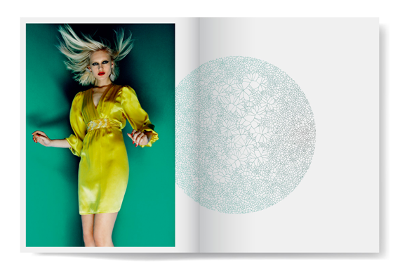
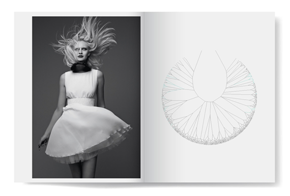
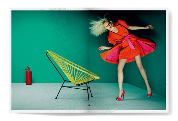
I'm a big fan of these graphics + photo pairings of this shoot, by design group, Beetroot. I'm always drawn to illustration/design paired with fashion and Beetroot really created some beautiful images for Access' Spring/Summer 2011 fashion book.

Spaces // Meg Lewis

Monday, February 4, 2013

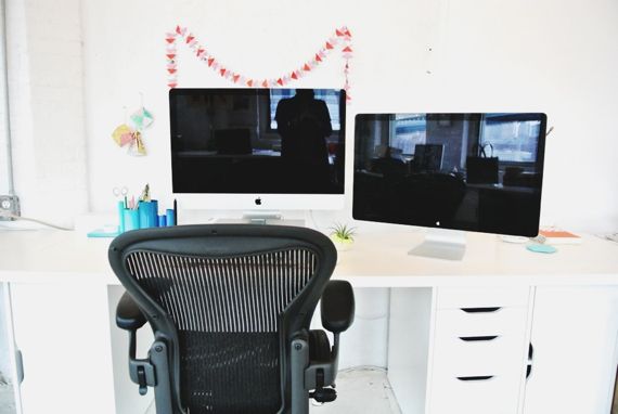
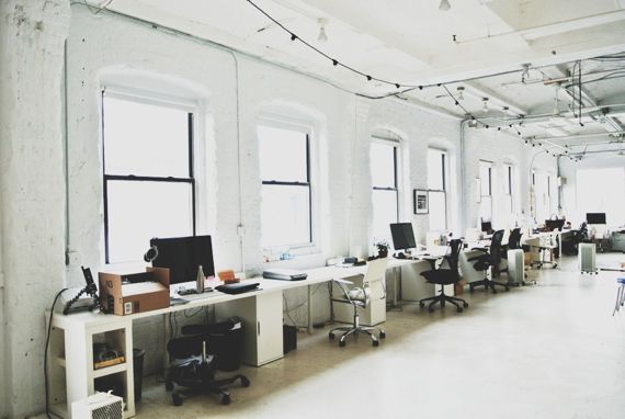
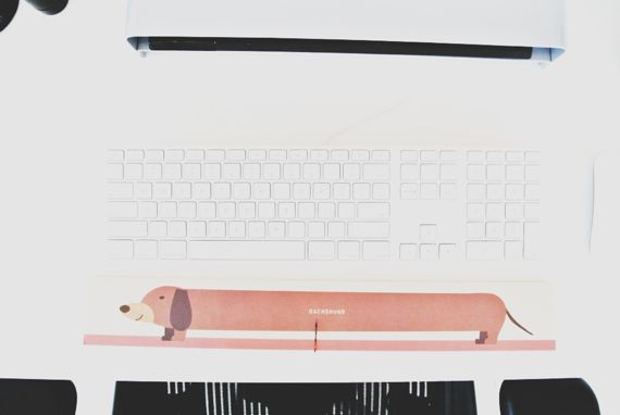
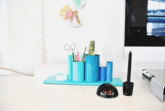
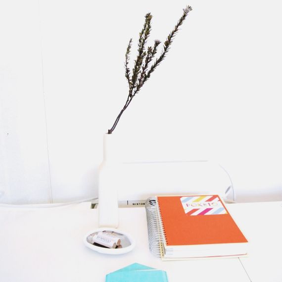
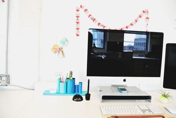
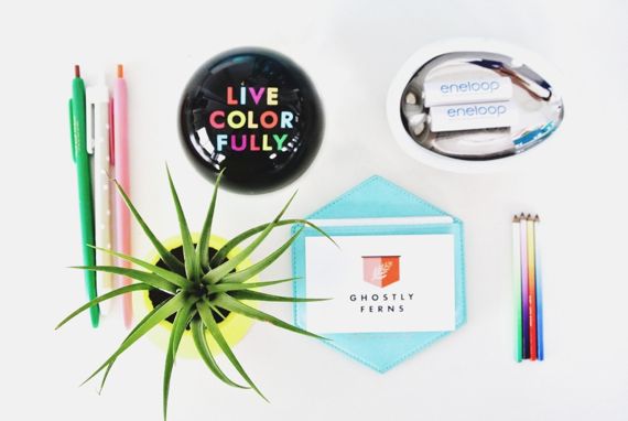
This week's Spaces feature comes to us from Web + UI Designer, Meg Lewis of Ghostly Ferns. Meg and the rest of her team at Ghostly Ferns put out some really, really beautiful work. Meg works in a shared studio space (which sounds amazing and has a KILLER view!), take a look!

Tell us about yourself as a creative.
I am a web & UI designer that finds myself doing some branding work as well. I am the owner of Ghostly Ferns, a small design studio based in the DUMBO neighborhood of Brooklyn, New York. I am perpetually happy and always an optimist. Somehow, those are my best and worst qualities at the same time. I think my personality really shows itself in my work. I only accept clients that are excited and passionate about their products! Exactly why I coined Ghostly Ferns as A web design, branding and illustration studio for happy people.

Describe your creative journey.
While I was in college for design, I knew that I never wanted to work for a company. I always had a dream of designing for clients I chose, setting my own hours and having the freedom to get out and see a movie on a Wednesday afternoon. I knew straight out of school that I was going to start my own design studio. With no experience and a heck of a lot of ambition, I was able to start Ghostly Ferns immediately. It was the kindness and support of the design community that really helped my business off to a running start. Over time I began working with early-stage startups and small businesses alike. Today, after 4 years, about 50% of my work comes from these startups and the other half remains with little online shops and blogs!

Share a little bit about your space.
I work out of a shared studio space called Studiomates. Most of the photos seen are from around the Studiomates office. Working out of a collaborative workspace of designers, illustrators, bloggers, writers and developers is truly the American dream. My individual desk is a little oasis that keeps me inspired. Coming to work everyday is so exciting! Sometimes I have to take a deep breath and remember that I actually have a job. Usually it feels like I'm playing all day. Beer in the fridge, amazing food around the corner, a work-in bartender and barista.

What's your favorite thing about your space?
The view! Nothing beats the insane Manhattan Bridge view of our waterfront property. Nothing is more inspiring than the Manhattan skyline. Nothing!

What's one thing you think every creative needs in their space?
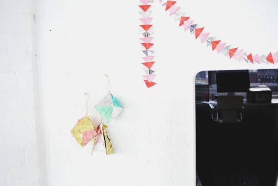
Whatever makes you happy. You should want to go to work and want to start your day. Fill your space with whatever you can to keep you motivated and excited about work. Maybe that's a bunch of Confetti System ornaments like me. Maybe it's some insane taxidermy. Maybe it's just photos of your family. It also doesn't hurt to also fill your space with other people that are insanely talented. I can't recommend a shared workspace enough!

Thanks Meg!

Check her out:
+ Blog
Pin It button on image hover